Wood Mackenzie’s Brand relaunch
A modern, unified, and strategically positioned brand that reflects Wood Mackenzie’s role in the evolving energy landscape while strengthening its competitive edge.

Client
Wood Mackenzie
Services
Brand Architecture, Brand Design, Brand Guidelines, Brand Positioning, Brand Strategy, Corporate Communication, Digital Design, Marketing & Communications, Visual Design, UX/UI Design.
Industries
Energy
Date
July 2023
A Bold New Identity for Wood Mackenzie. In 2023, following its acquisition by private equity, Wood Mackenzie relaunched its brand to unify a fragmented identity. Years of growth, a diverse product portfolio, and multiple acquisitions had led to sub-brands with inconsistent visuals, diluting the brand’s impact. The goal was clear: create a bold, streamlined identity that sets WoodMac apart, cuts through industry clutter, and simplifies sub-branding. The result? A cleaner, more sophisticated, and high-impact brand that reinforces Wood Mackenzie’s strength, credibility, and leadership in the energy transition.


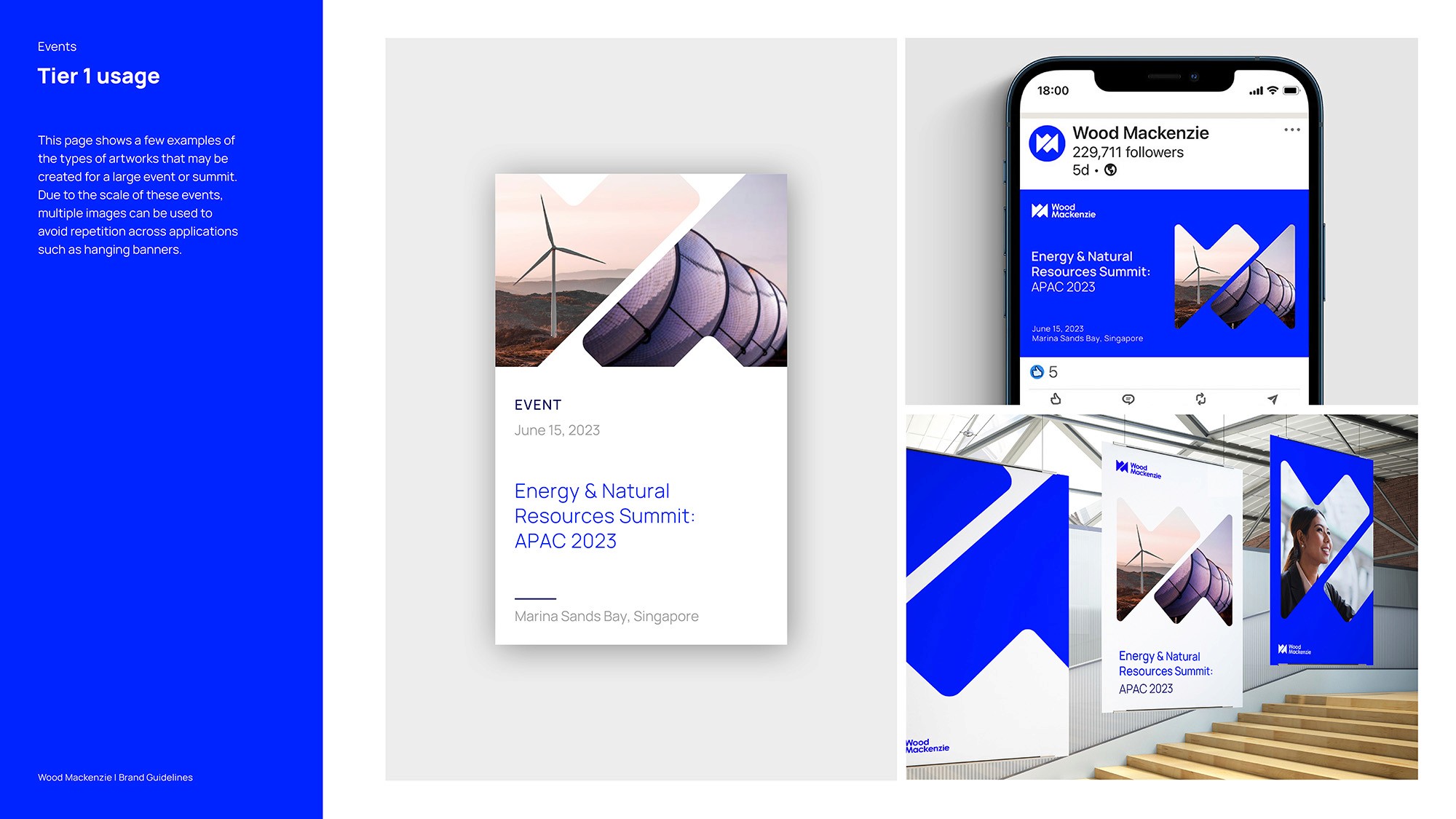

Previously, our brand was fragmented—styling elements, colors, and imagery varied across sub-brands. With the refresh, we embraced simplicity while maintaining differentiation. Enter the Flex System: a dynamic approach that reimagines our emblem through varied angles, cut-offs, and placements, giving each product and service its own distinct character while staying true to a unified brand identity. Our six flexes from left to right, you can see how we apply our symbol as a graphic property at increasing scale.