REC Power
2026
Greentech Media's first native app

Impact
Shipped to the App Store. Live roughly two years. Sunset by a corporate integration, not by performance.
team
Creative Direction: Kristine LaRocca
UI Design: Kristine LaRocca and
Binh Nguyen
Prototyping: Binh Nguyen
Development: Happy Cog
skills
Creative direction
Design strategy
Information architecture
Native App UI
Stakeholder Buy-in
Developer Handoff
The Challenge
Greentechmedia.com reached a wide audience. Mobile engagement did not keep up.
Our readers were energy professionals. They checked news between meetings, at conferences, on job sites, and in places with unreliable connection. The mobile site treated all of them the same way and asked them to be online to read anything.
The bigger challenge came before any design work. Nobody had decided the app was worth building. A native app was a real investment for a publication our size, and the question of whether to fund it was open.
How I built it
Move 1. I came in to make the argument visible
The argument for native came down to three things the web could not do. Offline reading, which mobile web could not do at all. Push, which mattered in a market where policy and project news breaks fast. And real performance, which native gave us for free.
Everything else on the wishlist could technically live on the web. Personalization and in-app purchase were better native, but better is not the same as impossible, and only the impossible things justified the cost.
Marketing carried the strongest argument, which was our user base. Our readers were a defined professional audience, not general news traffic. That made personalization worth building rather than a nice idea.


Move 2. I kept the links most designers would have cut
This was the decision I spent the most time on and the one I'd defend hardest.

A generalist would have cut the sector links to clean up the nav. In clean energy, the sector is the reason someone opens the app.
Move 3. Prototype, test, hand off
We ran pre-launch user testing to validate the interface and the journeys before committing to build. Handoff went through Zeplin with native specs to Happy Cog, who developed the app. They sent beta builds over as they went, so we reviewed real screens on real devices instead of waiting for a finished handover.



Personalized feed. Content by user interest: solar, grid, policy.
Push notifications. Real-time alerts and recommendations.
Offline access. Download and read without Wi-Fi.
Podcast integration. Stream industry news directly in-app.
Smarter navigation. Faster access to trending and saved articles.
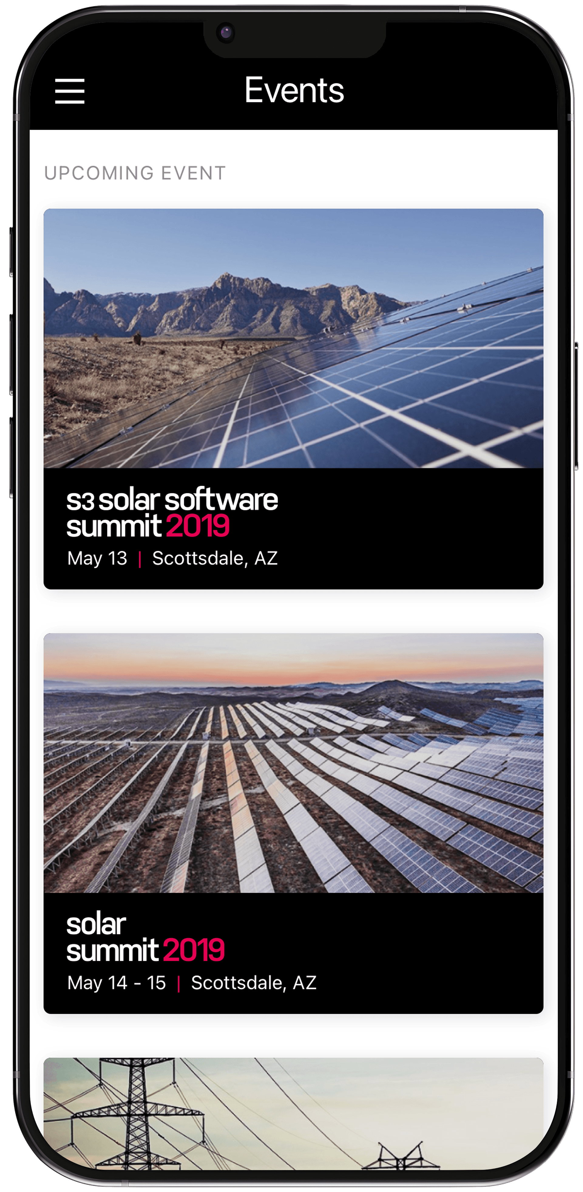
Event discovery. Browse location-based energy events.
In-app sharing. Send articles to colleagues with one tap.
Automatic updates. Website integration keeps content current without editors publishing twice.
Working with stakeholders
Funding the app was a push. It was not a project anyone was waiting to approve.
What moved it was our head of marketing, who took the case forward and secured approval. The prototype did not do the convincing. What it did was show behavior. People could see how the app would actually work instead of arguing about a description of it, and that took a category of vagueness out of the conversation.
The app also earned support because it did more than deliver news. Readers could get to event information, and offline article downloads turned out to be one of the features people liked most. That range made it easier to defend as a product rather than a second version of the website.
The Outcome
The app shipped to the Apple App Store in 2019 and ran for roughly two years.
It gave energy professionals something the mobile site never had: sector-level content they chose, articles that worked without a connection, event access, podcasts, and one-tap sharing with colleagues.
Wood Mackenzie had acquired Greentech Media in 2016, but we kept operating as ourselves. Our own brand, our own newsroom, our own product decisions. The app was built and launched inside that independence.
That ended in 2021. Wood Mackenzie fully integrated Greentech Media, stopped publishing to the site in mid-March, and the app was retired along with the publication.
It ended because of a corporate integration, not because of how it performed.
Reflection
I'm proudest of the navigation call, because it was the decision where domain knowledge beat design convention. Years in clean energy told me our readers sorted by sector. A designer without that background would have simplified the nav, shipped something cleaner, and made it worse.
What I'd do differently: I'd document the sector navigation logic as a standalone piece of reasoning at the time, not just as a design output. When the publication was folded, the thinking went with the product. A written argument for why that structure worked would have outlived the app.
Building something that ships and then gets sunset by an acquisition is a specific kind of experience. The work was still right. The company it belonged to stopped existing. Those are separate facts and I've stopped conflating them.