REC Power

2026

Where to Spend the Design

Web Design

Climate Tech

Campaign

Design Lead

Web Design

Campaign

Climate Tech

Design Lead

Gareth Evans, VECKTA's CEO, had a book coming out on May 19, 2026. Powering Profits argues that onsite energy has moved from a sustainability line item to a business strategy, and VECKTA brought DG+ in to build the launch campaign.

Three deliverables came out of that. A gated workbook readers could download, a landing page to host it, and a set of social templates VECKTA could keep using after we rolled off.

Impact

Shipped: Three deliverables in five weeks, against a launch date that could not move

Still in use: VECKTA publishes from the Canva system on LinkedIn

Reused: The landing page became a template on their site for content beyond the book

team

Senior Visual Designer
(myself, design lead)

DG+ account and communications lead

Project manager

Communications support

VECKTA's developer

skills

Editorial Design

Design Systems

Information Design

Art Direction

The Challenge

The date could not move. Brand guidelines review started March 13, the workbook was final April 23, and the landing page went live at the start of May.

The harder constraint was volume. VECKTA wrote the content, and there was a lot of it, all substantive. The workbook followed the book's five-step roadmap, and every step arrived with real material behind it. Site profiles with square footage and utility rates. Payback math. Financing structures. A portfolio example where 186 sites became a $20 million deployment instead of a $166 million one.

None of it was padding, which is exactly why it was a problem. Padding is easy to cut.

It also went deeper than the book. The three sections the roadmap sits inside, challenging limits, adapting purposefully, and empowering co-creation, are VECKTA's own company values. So the workbook was not built on a book that happened to be for sale. It was built on the structure the company uses to describe itself, which is part of why the content had so little give in it.

The landing page had the same load. Body copy, seven endorsements, four messaging pillars, an audience list, and a form. On a page built to capture leads, that is a lot of reading before anyone reaches the form.

And copy was still being corrected right up against sign-off, which meant layout had to be structurally right before the words were settled.

How I built it

Move 1. Decide where the design effort goes.

VECKTA's site runs on WordPress with a component library already built. Anything I designed either used those components or required new ones.

VECKTA's site runs on WordPress with a component library already built. Anything I designed either used those components or required new ones.

I designed an alternate landing page layout in Figma to see what a different look and feel would give us, and shared it with the communications manager. I never took it to the client.

I designed an alternate landing page layout in Figma to see what a different look and feel would give us, and shared it with the communications manager. I never took it to the client.

Left: Concept (Now shown to client)

Right: Landing page that shipped

New blocks meant new development time on a build VECKTA already owned, against a launch that was not moving, and their developer would absorb it. The existing components matched their site cleanly. My read was that the visual difference would not return enough to justify the cost or the schedule risk.

New blocks meant new development time on a build VECKTA already owned, against a launch that was not moving, and their developer would absorb it. The existing components matched their site cleanly. My read was that the visual difference would not return enough to justify the cost or the schedule risk.

So I set my layout aside and moved the effort to the workbook, which was the piece with real creative range.

So I set my layout aside and moved the effort to the workbook, which was the piece with real creative range.

How I built it

Move 2. Make density navigable instead of shorter.

The brief specified a horizontal PDF with visuals users would scroll through sideways. PDFs page, they do not scroll, and landscape pages of dense reference copy read badly. I changed it to portrait during concepting, before production started.

The brief specified a horizontal PDF with visuals users would scroll through sideways. PDFs page, they do not scroll, and landscape pages of dense reference copy read badly. I changed it to portrait during concepting, before production started.

The book runs a sustained driving metaphor, and the client did not like the book cover, so the connection had to come from somewhere other than resemblance. I abstracted the route into a flowing line that runs across the cover, the interior, and the back cover. It reads as a journey and it carries the eye from page to page.

The book runs a sustained driving metaphor, and the client did not like the book cover, so the connection had to come from somewhere other than resemblance. I abstracted the route into a flowing line that runs across the cover, the interior, and the back cover. It reads as a journey and it carries the eye from page to page.

Step 4 explains what gets built on a site and why, across five technical points. That does not fit on one page. Forcing it onto one would have meant shrinking the facility image until the callouts stopped pointing at anything, so it runs across two. Printed, it reads as a spread. On screen it still works, because the reader can move across the building and go into each area instead of taking it all in at once.

Step 4 explains what gets built on a site and why, across five technical points. That does not fit on one page. Forcing it onto one would have meant shrinking the facility image until the callouts stopped pointing at anything, so it runs across two. Printed, it reads as a spread. On screen it still works, because the reader can move across the building and go into each area instead of taking it all in at once.

The rest was structural. Step 2 became charts. Step 3 became three sites mapped against their trade-offs with a clear call on each. Step 4 became cards. The copy barely got shorter. It stopped reading as a wall.

The rest was structural. Step 2 became charts. Step 3 became three sites mapped against their trade-offs with a clear call on each. Step 4 became cards. The copy barely got shorter. It stopped reading as a wall.

The part I did not have to ask anyone about was the imagery. Most stock photography and generic vector iconography gets onsite energy wrong, and it gets it wrong in ways that are invisible to a designer and obvious to the people this workbook was written for. Being well versed in this sector, so I know what a real installation looks like, what belongs in a diagram of a site, and what would have looked fine on the page and wrong to a facilities director. Every image and icon in the workbook was chosen against that.

The part I did not have to ask anyone about was the imagery. Most stock photography and generic vector iconography gets onsite energy wrong, and it gets it wrong in ways that are invisible to a designer and obvious to the people this workbook was written for. Being well versed in this sector, so I know what a real installation looks like, what belongs in a diagram of a site, and what would have looked fine on the page and wrong to a facilities director. Every image and icon in the workbook was chosen against that.

How I built it

Move 3. Build it to keep running.
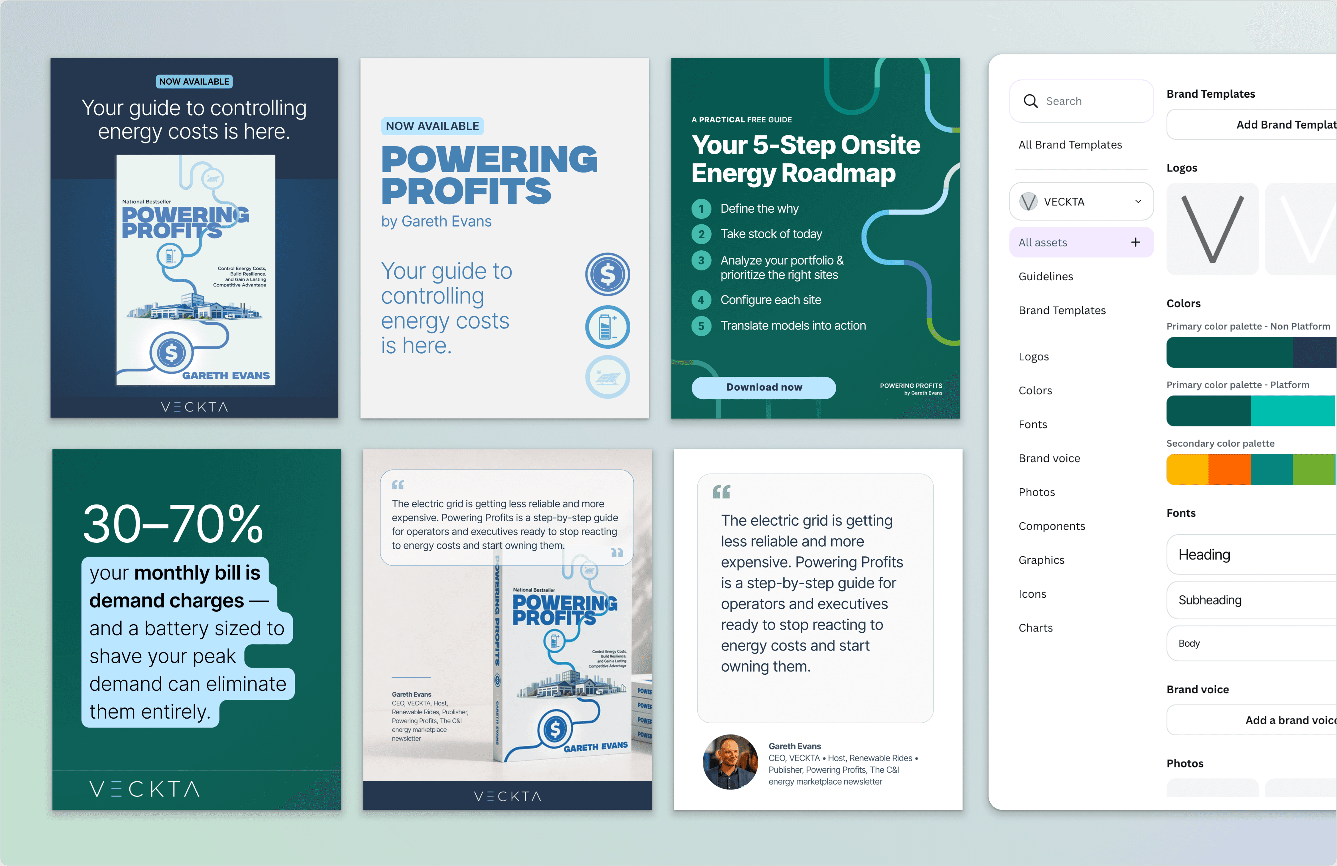
The last deliverable was a Canva brand kit and template system. VECKTA's colors, a full type scale, drag-and-drop imagery, iconography, and graphics, with LinkedIn templates at 1:1 and 4:5.

The last deliverable was a Canva brand kit and template system. VECKTA's colors, a full type scale, drag-and-drop imagery, iconography, and graphics, with LinkedIn templates at 1:1 and 4:5.

That was built against a real cadence. The campaign called for one to two posts a week before launch, two to three during launch week, and one to two a week after, running four weeks either side. One-off graphics were never going to survive DG+ rolling off.

That was built against a real cadence. The campaign called for one to two posts a week before launch, two to three during launch week, and one to two a week after, running four weeks either side. One-off graphics were never going to survive DG+ rolling off.

The workbook's cover and interior pages carried across as well, used as the imagery promoting the download on the landing page and inside the social templates. One visual anchor across three surfaces.

The workbook's cover and interior pages carried across as well, used as the imagery promoting the download on the landing page and inside the social templates. One visual anchor across three surfaces.

Working with stakeholders

I pushed to cut the copy, and my argument was a craft one. A landing page that reads like a book stops being readable, and legibility takes the hit first.

Communications pushed back, and that position was also fair. The content was doing work, the client had supplied it, and the client wanted it.

So I stopped arguing about length and cut it myself. I laid out a version with the cuts already made and showed the difference instead of describing it, mostly through the workbook where the contrast was easiest to see.

That produced a compromise. Some cuts held. Other wording the client wanted kept, and it stayed.

The developer sat on the client side, so the page handoff crossed organizations. I handed over a component-based page assembled from elements already in their library, which meant the developer was working with known parts rather than building new ones. VECKTA has since reused that page as a template for other content.

The Outcome

Everything shipped on the launch date.

VECKTA holds the performance data for the page and the download, so I have no campaign metrics. What I can see instead is that both systems are still in use. The Canva kit shows up on their LinkedIn feed. And the landing page has become another template option in their WordPress site, used for content that has nothing to do with the book.

That last part was not the plan. The page was scoped for the book and nothing else. I built it inside VECKTA's existing components to protect the timeline and avoid dev cost on their own build, and the reuse only came up at the end of the engagement, once it was clear the page could carry other content. Which is a better outcome than a planned one, because it means working inside the constraint produced something nobody had scoped.

At the close I wrote the creative recommendations, as a pitch for continued work. The first was to expand the landing page from a single-purpose book page into a flexible component system, naming the gaps directly: image placement, interactivity, and layouts that can carry long-form content. That is the same constraint that stopped my Figma layout, raised at the point where it could be scoped and paid for instead of squeezed into a launch. The second was to build an interactive tool from the workbook, so a business could adjust its own inputs and watch a utility bill turn from a fixed expense into a profit lever.

Reflection

The decision I am proudest of is the one nobody saw. Killing my own layout was the right call, and it is the kind of call that never shows up in a portfolio because there is no artifact at the end of it.

What I would do differently is raise the component question at kickoff as a scope item rather than absorbing it later as a design constraint. It was the right read for that timeline. But named early, it becomes a budget conversation while there is still time to have one.

Create a free website with Framer, the website builder loved by startups, designers and agencies.